Poster Design for MSSF
Your poster is a visual representation of your project and is an important tool you will use during your interview with judges. It should be able to explain your project even if you are not there to talk to the viewer. It is a tool to help you when interacting with the judges. Every piece of your display should improve communication, not get in the way.
When developing your poster, ask yourself these three questions:
- What is the most important, interesting or astounding finding from my research?
- How can I visually share my research with judges? Should I use charts, graphs, photos, etc.?
- What information can I convey when talking to judges that will complement my poster?
Two Main Display Formats
Traditional Three-Column Poster
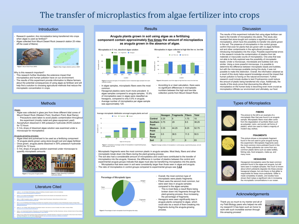
Poster by Samantha Ismail of John Bapst Memorial High School.
Traditional Four-Column Poster

Poster by Vetri Vel of Bangor High School.
"Poster 2.0"
This is a new way to create a scientific poster. It is simple, clean, and sparse (this is where white space really is your best friend). The main research question or finding is written in the middle of the poster in plain language in large letters; this really grabs the viewer’s attention. There is a code underneath that viewers can scan using a smartphone if they wish to see more details of the study. On either side of the title is where the introduction, methods, results, conclusions and references are displayed. This format really challenges you to display only the most important pieces of your project.
This is a new way to display scientific research, but don’t be afraid to be different!

“Poster 2.0” design seen at the American Meteorological Society Conference, 2020. Photo by Rebecca Clark Uchenna
For more information and the reasoning behind this new poster design, check out these resources:
- To Save The Science Poster, Researchers Want To Kill It And Start Over
- How to create a better research poster in less time (start around 10:00 if you want to get right to the new poster format)
- Critique of the Morrison Billboard Poster
Poster Templates
What to Include on your Poster
There are certain sections that should be included in your poster, but remember that your poster isn’t a blown up version of all your research – it is just the highlights that are brief and concise. A strong poster has logical organization of material, clear graphics and legends, and supporting documentation displayed.
Include:
- Title
- Purpose or Engineering Goals
- Hypothesis or Problem Statement
- Background
- Materials
- Procedure
- Data/Results
- Conclusion
- Future Research
- Works Cited
DO NOT Include:
- Potentially offensive photos
- Photos of people who have not signed a photo release
- Work not done by the student researcher(s)
See our Rules if you have questions about any of these items.
What the Judges Will Look For
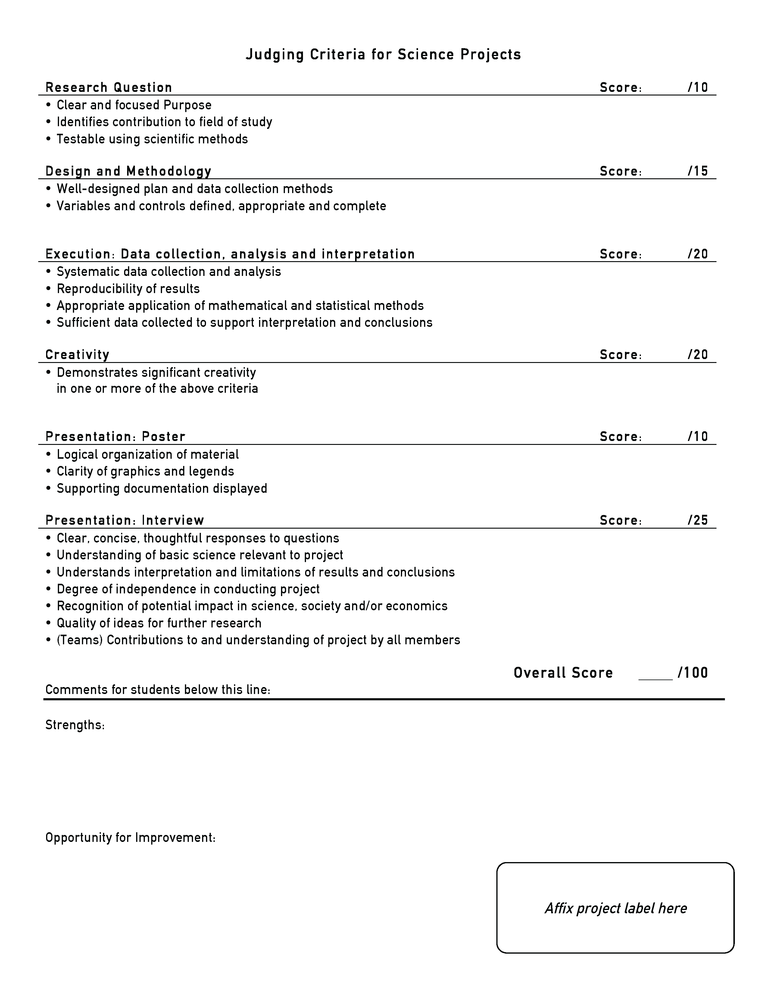
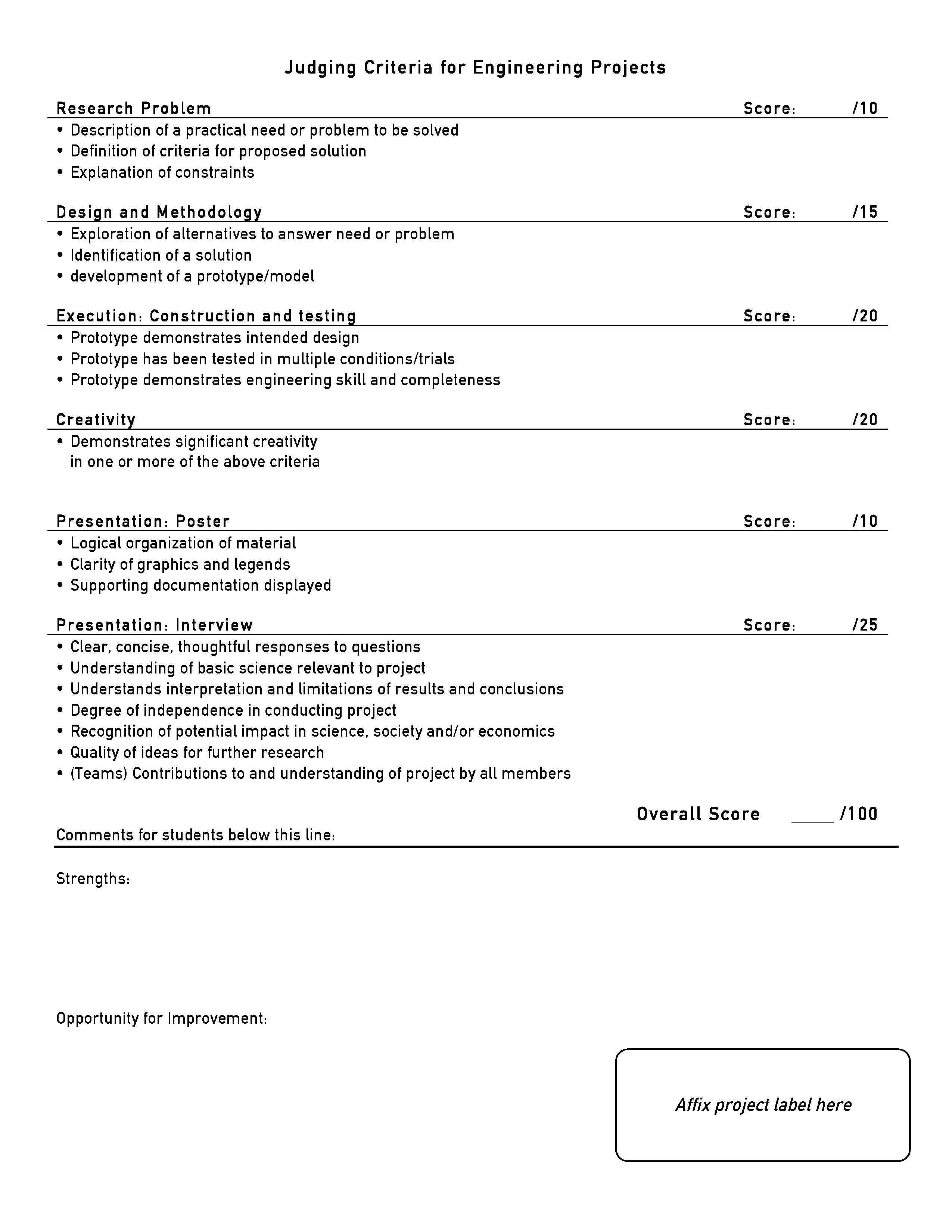
Judges will use something called a rubric to assess your project. The rubric has different sections that represent different phases of your project. They will consider your abstract, poster, and interview when deciding how well your project meets the criteria. There are two rubrics: one for science projects and the other for engineering projects. See the rubrics below.
Science Rubric
Engineering Rubric
Planning Your Content
Your poster should give a summary of your work, so decide on a few key points you want to get across to your viewers. Your poster should entice the viewer to talk to you about your project. What are the three most important things you want the judge to know about your project? Focus on those!
Small, concise blocks of text are easier to read, and white space (believe it or not) is your friend! Your goal is to make your poster easy and quick to read. Bullets and numbered lists make procedures or material lists easier to follow while also adding white space.
Keep your writing clear, avoid jargon and make your sentences easy to digest. Use the past tense and active verbs when describing what you did. Many of the tips shared in our Abstracts lesson will also help when writing pieces of your poster. And most importantly, proofread, edit and ask others to review your poster!
You should also consider readability when it comes to styling your text. Read on for guidelines about text size, typeface, and color scheme.
Text Size
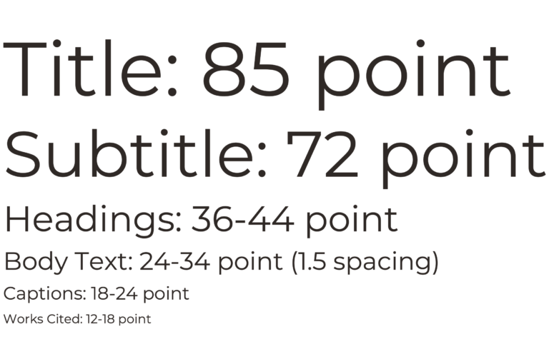
To help with readability, align your body text to the left. You can center titles and headings, but your body text should always be aligned to the left. Font size should be easy to read from a distance of 3 feet or more. Below are font sizes we recommend for each of your poster sections:
Typefaces
Choose an easy-to-read typeface. You may choose to use two contrasting styles: one for headings and the other for body text. Below are some examples recommended by accessibility experts. Sans-serif fonts are generally considered easier to read than serif fonts.

Color Scheme
It can be a lot of fun to choose the color scheme for your poster! The colors you choose can elicit an emotion in the viewer or go along with your project topic. Doing an ocean-related project? Try blue or green. Doing a soil investigation? Maybe brown is the way to go. Be creative but keep in mind the following guidelines:
- Choose a main color and 1-2 accent colors. Use your accent colors consistently. For example, you might make the background of each heading blue and use orange and gray in your charts. See the image at right for some color scheme inspiration.
- Be careful with background images. While your poster may look very interesting from afar, the background image could make it difficult to read your text. If you use a solid-color background, be sure there is a good contrast between the background and text (think white on black, not light gray on dark gray).
- If printing your poster on a large-format printer, run it through COBLIS! COBLIS stands for Color Blindness Simulator. Did you know that there are many kinds of Color Vision Deficiency (CVD)? COBLIS allows you to upload an image of your poster and then view it through the lens of a person with CVD. You might find that your poster’s not as easy to read as you thought!

Image Requirements
There are certain requirements you need to be aware of when it comes to photos. Each photo that you use must have a photo credit line (Photo taken by…). If all photos are from the same source, then a single credit line is fine. If you took a photo of a person, you need a photo release from them and if the person is under 18, you need a parent signature (unless the photo is of you or your teammates). [Note – your photo release forms do not need to be displayed at your poster, they just need to be in your files in case someone asks for them]. Please, no offensive photos. Examples of offensive photos could be nudity, dead animals, dissections, etc. If you have questions about photos, please contact the MSSF fair directors. Finally, make sure photos are high enough resolution so they print clearly. Blurry photos are not very nice to look at.
Use of Images
Images can come in very handy when talking about your project. Use of images may include system diagrams, materials used, comparisons (before and after photos), an apparatus or prototype. A picture’s worth a thousand words. What are your photos saying for you?
Poster Construction
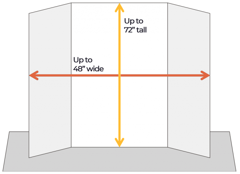
Your poster must be free-standing on its own. It must be no wider than 48” and no taller than 72”. These rules are very important to follow because space will be very limited at the Science Fair.
Before you begin designing your poster, decide on your poster size. Many cardboard or foam tri-fold posters are 36” x 48” and can be found at craft and office supply stores or ordered online. You can choose a colored board if you’d like (i.e. black, green, blue, red) that can be used as your color scheme throughout your poster.
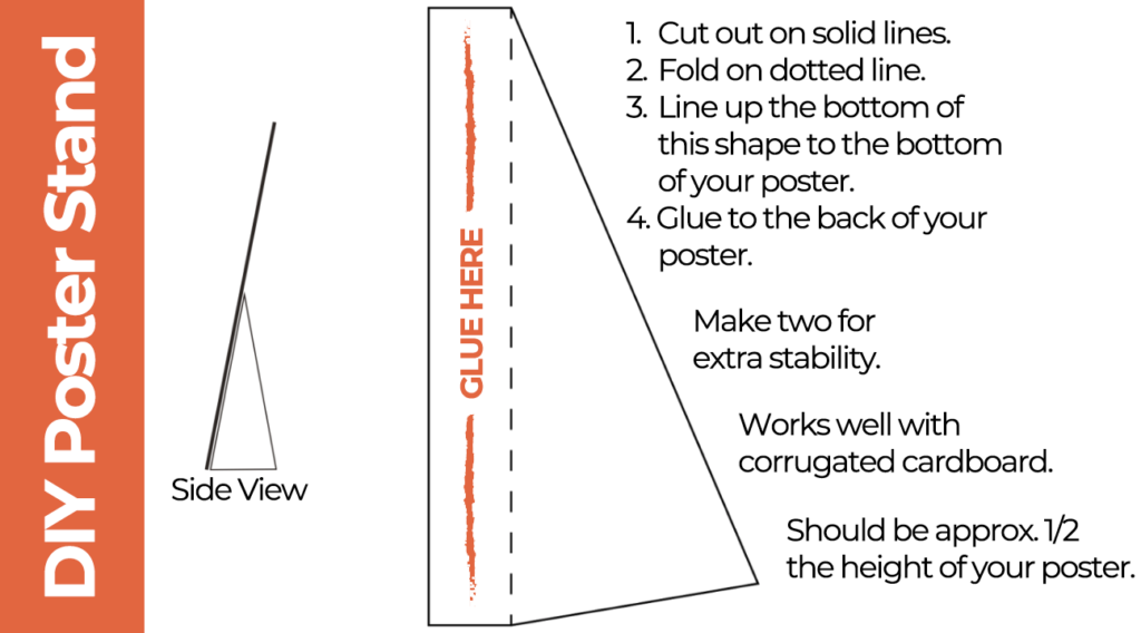
Remember, your poster must be free-standing on your table, so either choose a tri-fold poster board, bring a tabletop easel, or design your own poster stand to keep your poster upright. See how to make your own poster stand below.
Producing Your Poster
Another big decision you need to make is how you will produce your poster. You can either:
- Print your full poster on one large piece of paper using a plotter (done at an office supply store or at your school) OR
- Print each part of your poster on a standard printer and attach them to your display board.
Large-format printing looks more professional but it is more expensive ($25+). Most students who print their posters attach them to their display boards with binder clips instead of using glue or tape. Cutting and pasting costs less and you’re able to make corrections more easily, but your poster could look messy if you do not take care to line up all of the pieces.
Please note – judges do NOT take printing into consideration when scoring your project (there isn’t one method that’s better than the other).

Dwight Knightly of Bangor High School went with a printed poster while Kaitlyn Dunham of Old Town High School used the cut-and-paste method.
Other Display Materials
Your poster isn’t the only thing you can have at your MSSF display. Here are a few additional items that can take your project to the next level. Be creative, but make sure that your display items don’t violate any of our display rules.
Lab Notebook
A lab notebook documents your data collection and/or prototype development. It’s an important part of your display. You want the judges to be able see all the work you put into your project! Your notes may be in an actual notebook, but they could also be on your computer. Rather than printing out the entire set of notes, you can have a tablet or laptop available to display your work. Just be sure that your device is charged, and don’t leave it unattended.
Code and Apps
If you did a computer science project, consider having your code available for the judges to see. If you developed an app or other program, you could have it there for them to try.
Prototype or Other Apparatus
If you created a prototype and want to show it off, bring it along! Other display items you could bring include your experimental setup or some samples for the judges to view. It will need to fit in front of your poster on your 4-foot table, so if it’s large you might want to leave it at home.
Next lesson: The Interview